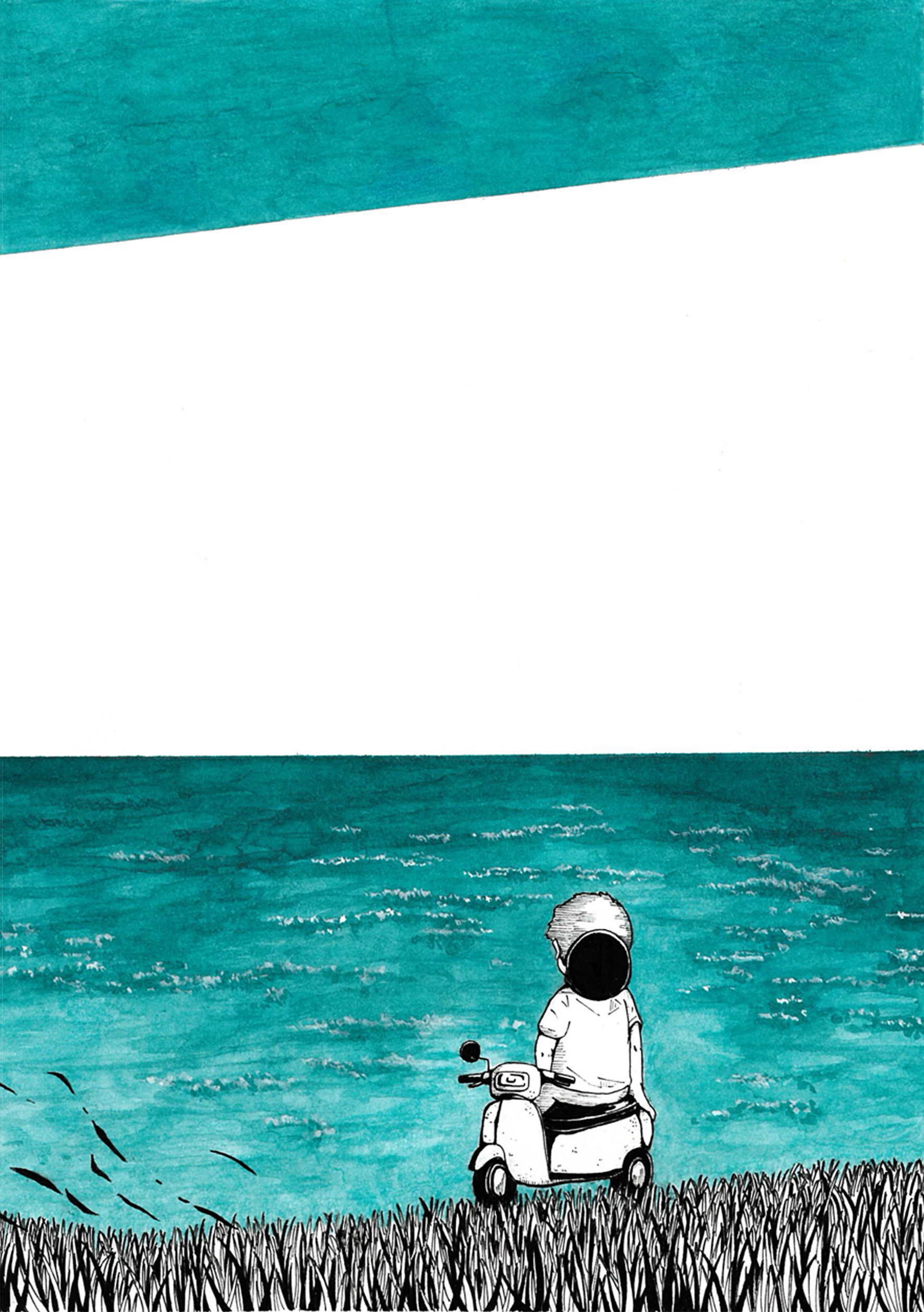
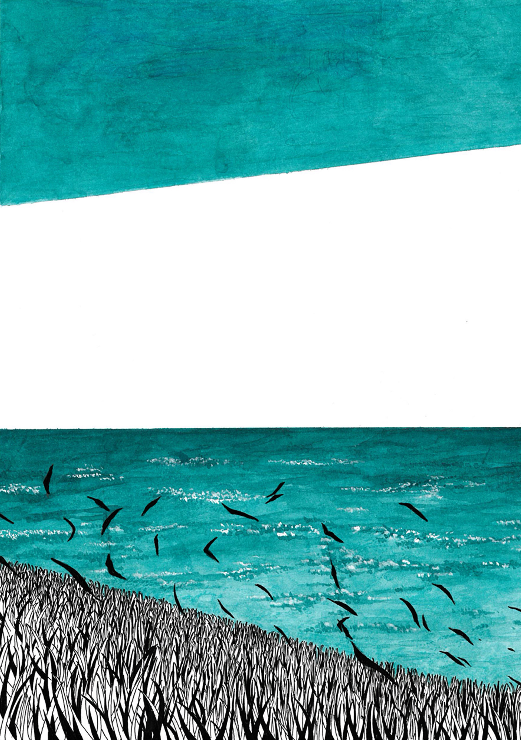
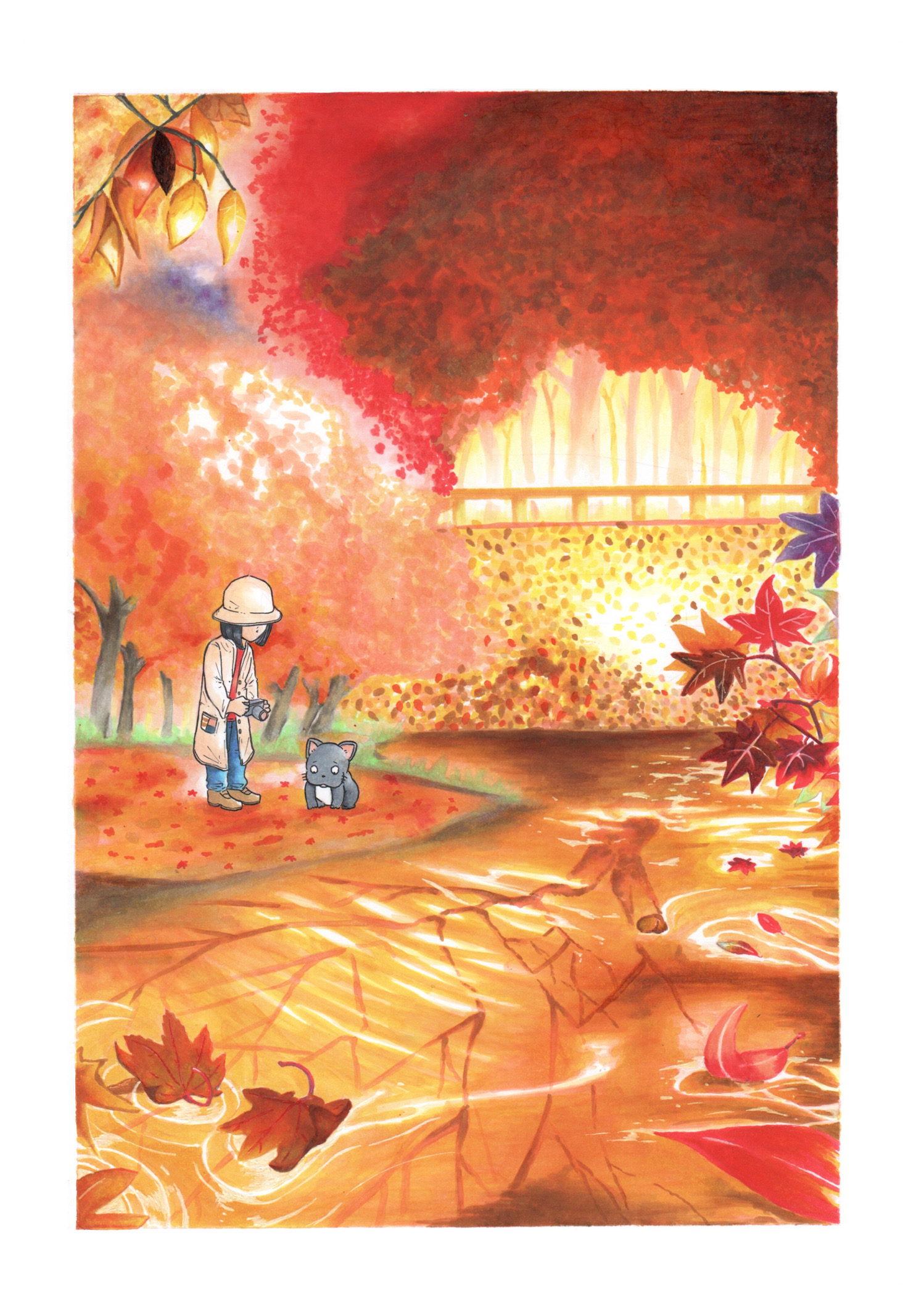
I used Ink Kobo 564 and Gokukuro.
To make the most of the color range of a single ink, I created a gradient composition, using Gokukuro to highlight the 564 and give the overall design a sense of cohesion. Additionally, to convey a sense of spaciousness, the front and back sides flow seamlessly into one another.

💬 みんなのコメント